I think I just snapped
One of my biggest pains with porting my WP7 app to Windows 8 is the “Snapped View”, an interesting feature added to Windows 8 to provide “smart” docking for apps and properly allow 2 apps to run simultaneously on screen, as a user this looks great, as a developer it is a right royal pain in the rear.
I say this because there is no opportunity as a developer to choose NOT to provide this feature, it is mandatory and you HAVE to do something. Even when it makes absolutely no sense at all for your app.
Microsoft’s answer to this is to be expected, “shut up and sort it”, they recommend if you do not want a snapped view then you should just show a logo or other static content because that is what they do. Not exactly the best approach.
This gets worse if you have multiple pages within your app as you need to define the “Snapped” view for each of them.
Where is “Snapped” view?
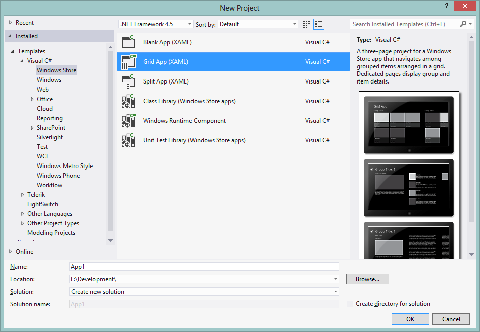
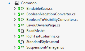
If you started your project using one of the constructed templates like “Grid App” or “Split App” you already have the necessary components which are placed into the “Common” folder.
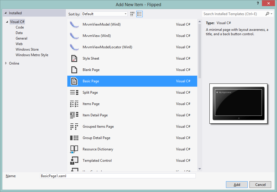
If you started with a “Blank App” you can add these bits by just adding one of the constructed item templates like “Basic Page” or “Split Page”, etc. basically anything other than the “Blank Page” template will add them.
What will be added is the following folder with some boilerplate code and functionality (why this is not here by default is anyone’s guess), amongst the suspension manager (a state saving lib just like the Phone application states of WP7) and default value converters is the “LayoutAwarePage” template control.
Now I’d recommend starting new pages with one of the item templates mentioned earlier rather than trying to force it into one of your existing pages, but if you feel so inclined then create a new “Basic Page” and copy the following to your existing pages to add the necessary elements:
- In the XAML page change the top level class type from “Page” to “common:layoutAwarepage”
- Add the namespace for “common” if not already there, its just a normal “local” reference
- Copy the “ApplicationViewStates” visual state group from the bottom of the page into the same place in your own page (just be sure to remove any storyboard targets for elements that are not on your mage, like “backButton” and “pageTitle”
- In the XAML.cs page change the inherited class type from Page to “LayoutAwarePage”, you might also have to resolve that reference.
- Copy the “LoadState” and “SaveSate” functions to your code behind, you need this even if you do not intend to use them
*Proviso I still recommend creating a new page and copying your content to it as it is cleaner
Configuring Snapped View
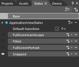
With the above in place (or your new app in hand) when you open your page in Blend, in the “States” panel you will find several default states provided for you in the page.
And here is our snapped view along with the rest. Now if you have designed you page using scalable values (basically not using FIXED pixel values) then you should not have to word about Filled and FullScreenlandscape, they should just be the same as your “base” state and do not need anything special. Portrait is another matter entirely but that is a different post.
So we have our snapped visual state and configuring it is no different to designing for other visual states, just click on the state and you will be switched to “Recording Mode”. Now just arrange your page to how you want it to appear in snapped view.
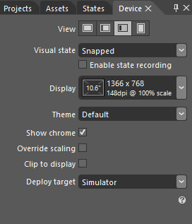
To help with this the designer also has a “Snapped” mode viewer, just switch to the “Device Pane” and you will see several options to change how the designer looks to mimic what it will look like on the device:
You can change the View from Landscape, to Filled, portrait and of course snapped, you can also change the current view state (but I’d still recommend doing this on the states page), you can even change the resolution to see how your app scales.
*Note be sure to test in several resolutions as it is critical for certification!!
Feel free to play with the other settings but for now just select “Snapped” so you can see what you are designing.
Now I mentioned Microsoft’s little get out clause, just show a static image or alternate control for snapped, which you can do it is up to you.
*NOTE – WARNING!!!
A little buyer beware note, DO NOT change grid columns or rows while in a visual state, if you need to move things around and orientate the layout be sure to have designed your page in the “base” state (as in the default page layout) to be capable of handling it, else you will be in for a world of hurt. Add additional columns and rows prior to configuring the states and update your layout accordingly. This also hangs true for any “separate” controls you want to display in Snapped view, add them before and just make them not visible “Collapsed”
Another caveat to watch out for, is that Blend still feels likes beta software (I’m not a big fan of the the “it is only ready when SP1 comes out” mantra but in this case it may be true), is that SOMETIMES when you change a value while in state recording mode, Blend will alter the Base state of the control and NOT the Visual State you were intending. After you change each control just check how the other states look, including the base, to ensure Blend has recorded the change properly, if it does it a second time you might have to enter it manually in XAML, nothing major just copy a storyboard element that does the same thing to another control and change it is target, it is easy enough to learn.
And that is it. Now your page is layout aware and if you run the app in the simulator you can test how your app looks Snapped, rotated and in different resolutions for real. This is especially good if you don’t have a laptop / tablet that has a high enough resolution to use those features.
Watching for the state change
Now in some apps you can have long running processes that go on in the background which if you have opted for the “paused” or static page for Snapped view you will need to handle. For my project I have a game timer which I want to pause when the game is moved into snapped view.
This I found is quite easy to implement as you just need to attach to the “CurrentStateChanging” event of the visual state group “ApplicationViewStates” in your page constructor, thus:
